Editorials
Microsoft is at it Again
- Details
- By Sean Kalinich
- Hits: 2429
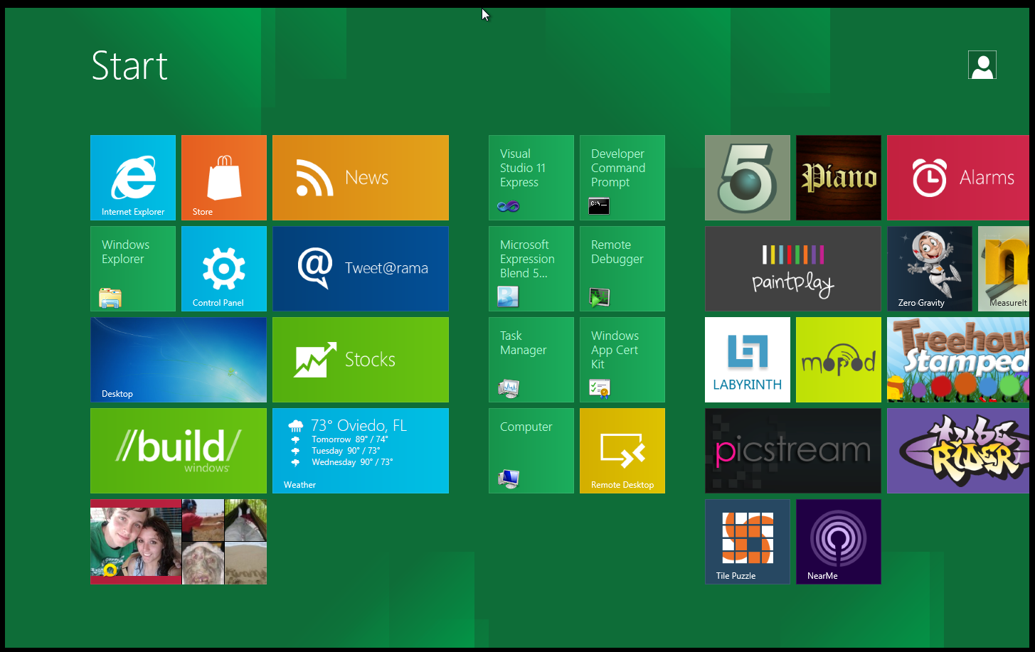
 Microsoft is at it again it seems. Sometimes I do not know what goes on in some of their meetings. After hearing the many complaints about the new Metro UI (also known as the Start Screen) Microsoft is choosing to defend it instead of working to make it a more workable product for everyone. This is from the latest Building Windows 8 Blog where we are treated to comments like “But, when you’re launching a new app, you’re leaving the thing you’re currently doing. So we wanted to take advantage of the whole screen to make launching and switching apps as efficient as possible” that are intended to make the MetroUI acceptable. The logic here is that you only want to use on Application at a time. This though process is not only ludicrous it shows an incredible lack of vision.
Windows 8 as an operating system MUST be able to bridge phones, tablets and the desktop. Making the start screen into nothing more than an enlarged tablet or phone launcher is ridiculous for any desktop scenario. On an average day I have between 6-8 windows open and floating on my desktop. On my Asus EEE Slate EP121 Tablet I often have 2-3 open just to do my normal tasks. In fact it is this ability that has always made the EP121 so much more attractive than any tablet I have ever worked with, even the Transformer which is by far my favorite non-Windows system. 
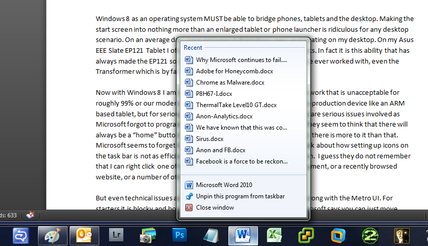
Now with Windows 8 I am being forced to work inside the very frame work that is unacceptable for roughly 99% or our modern productivity work. Sure it is nice for a non-production device like an ARM based tablet, but for serious work it is a joke. Even on the tablet there are serious issues involved as Microsoft forgot to program little things like a back option in the UI. They seem to think that there will always be a “home” button to take you back when needed. However, there is more to it than that. Microsoft seems to forget how Windows 7 works. In their blog they talk about how setting up icons on the task bar is not as efficient as large square icons all over your screen. I guess they do not remember that I can right click one of those and with ease open up a recent document, or a recently browsed website, or a number of other things. 
But even technical issues aside there is still quite a few other things wrong with the Metro UI. For starters it is blocky and boring and a pain in the ass to customize. Microsoft says you can just move things around; we tried it and unless we followed a certain pattern every time we had one of the larger rectangular “live links” we were stuck with gaps in the flow of the screen. We also had to be conscious of where we tried to put these links, they would not just arrange on the screen like with Android or iOS, they wanted to clump together. Personally I like the idea of standard icons and my choice of widgets that provide me with the information I want to see. Not a predetermined set of blocks that I cannot customize or adjust to suit my needs.
Microsoft, you are doing it again and you really need to pay attention. The Windows Phone UI is not popular; it is not a major selling point of Windows Phone so you really need to stop trying to force it on desktop users, if you do not (or at least allow it to be turned on and off) you will have another Vista on your hands which is something you really do not want at this time.
Discuss in our Forum


