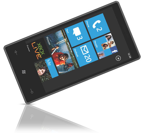
We are (of course) talking about the new MetroUI that is popping up almost everywhere that Microsoft goes (we have even seen it on their website). Once developer admitted that the Windows Phone UI (which forms the basis for Metro) was derived from the UI used in the Zune Player. This UI was fast and efficient for a small media player and was given great reviews from the press (we also liked the Zune UI). The problem is that the general public did not like it and sales of the Zune and later ZuneHD suffered for it. To many the UI was awkward and bulky, they commented that they had to pass through too many menu levels to find anything and then did not automatically get how to get back out. This did have an impact on sales and although the Zune HD was (and still is) a superior media player it has been discontinued.
With Windows 8, Xbox Live and Windows Phone Microsoft is taking that UI and expanding on it. The large text menus have been replaced with tiles (squares of rectangles). These can either have static text or function like widgets. Now, in theory this sounds very cool and it actually is a very novel way to do things. The problem comes when putting it into practice. The majority of the people we have talked to about the new UI (even showing them the UI on out EEE Slate EP121) they thought it was…. You guessed it; awkward, bulky and difficult to maneuver around in.
On the opposite side; the people that I know in the tech press have liked it and once they had the chance to tinker with it (especially on demo hardware) they were impressed. After having seen both I can say that the demo hardware was impressive, but once it hit real hardware the glamour began to fade. The UI is bulky and awkward; as of the latest build available to the public there is no efficient way to reorganize the Metro screen. There seems to be an auto sort that prevents you from making any type of flow to your desktop or work area. For many this will be a deal breaker in terms of usability.
There is also the problem with leaving out plug-ins from the Metro UI, although I understand the security implications it still is getting into the same type of space as Apple, which means the users that chose Android or like Windows for the flexibility that it offers will be annoyed (at the minimum).
To be blunt, there are too many things wrong with putting Metro in Windows 8 for desktop to list here. We can start with work flow and end up at wasted space in the UI and still not manage to get them all. We hate to see Microsoft miss the boat on something like this especially after they are working so hard to cripple their ARM version of Windows 8.
Realistically Microsoft knows it has to do something different; the problem is that they do not really get what the public really wants from their OS. With Windows 7 they made a big marketing push about how they listened to the consumer and designed an OS around their wants and needs. Now with Windows 8 they are doing that for everything except the UI… it just does not make any sense. Time is running out for Microsoft and Windows 8; there will be a Consumer Preview Program release on the 28th of February which means we could see the final as early as November of this year. Unless Microsoft can seriously turn around some of the problems with shoving Metro down the consumer’s throat they could be looking at a repeat of Windows ME and Windows Vista and that is something they just cannot afford.
Discuss this in our Forum
Editorials
Microsoft still does not get it when it comes to MetroUI
- Details
- By Sean Kalinich
- Hits: 3061
 Microsoft is once again betting on a losing horse. After failed attempted to form HDCP (High-Definition Content Protection) into every aspect of the Desktop with Windows Vista and failing to motivate people to buy the OS they are now pushing a UI that has failed to capture the markets imagination. The funny thing is that they are admitting to this and still cannot see what they are doing. As we have told you before, Microsoft tends to ignore what the public actually wants and seems to make business decisions based on what they think “should” work.


