Mobile Computing
Windows 8 on the EEE Slate Day 4 - Last Day
- Details
- By Sean Kalinich
- Hits: 7323
 Four days, I lasted four days before I had to go back to Windows 7 on the EEE Slate. I tried to get Hyper-V running but the Core i5 on the system did not want to work the way it should. In the end I have come away with some interesting observations about the state that Microsoft’s next OS is in and where it could be by launch date. The first thing I have to remind everyone is that this is a developer’s preview. It is intended to allow App developers to push out apps for their Metro UI and also to ensure that software and hardware are ready (drivers mostly). By releasing it to the general public Microsoft has done a very smart thing. They are getting the OS out and on the street. People are actually running this as their main OS right now. Now this is all great if you are using something like a Laptop or even a desktop. There truly is very little that Windows 8 cannot do right now. However, when it comes to a tablet… things begin to fall apart. The problem is not that there is no touch screen support; it is that there seems to be no multi-touch support. On the EEE Slate EP 121 under Windows 7 I have multi-touch gestures and greater control. In Windows 8 that is gone. Instead of a two finger tap to right click my only option is touch and hold.
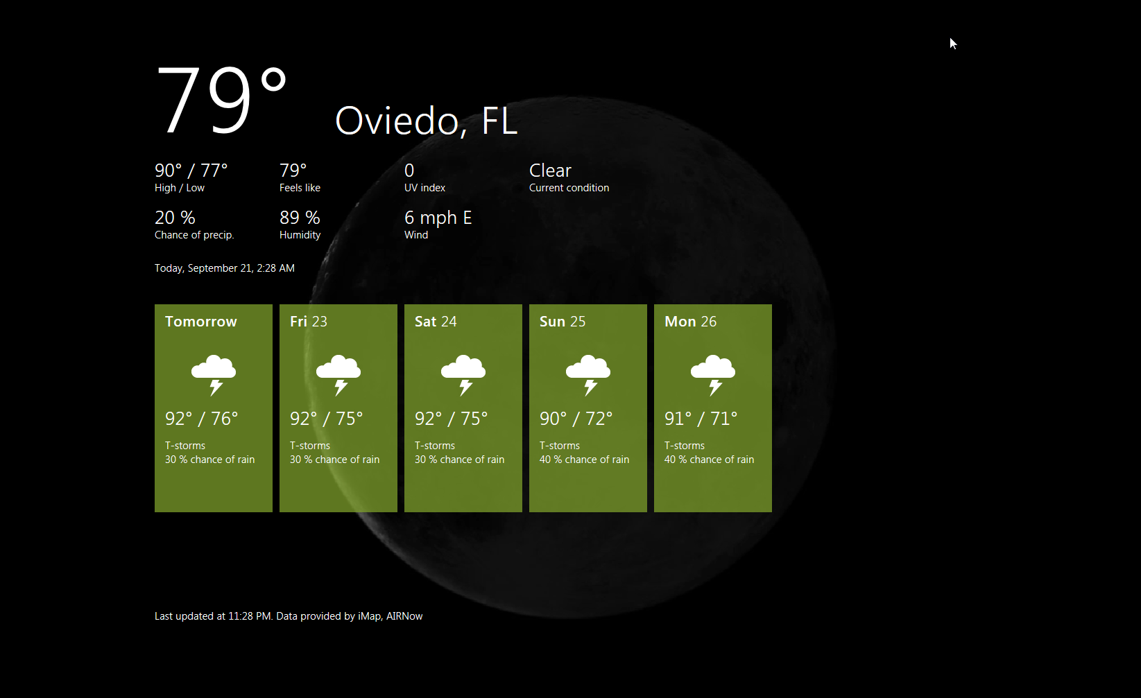
The matter is further complicated by Microsoft’s very immature Metro UI. It looks decent, but you cannot move things around to suit what you want or the layout you want. I do not like everything bunched up on one side on my tablet. I prefer it along the bottom. The Metro UI bunches the Apps and due to their different sizes breaks up any chance of a good flow. The lack of a Home button inside the individual apps is a big problem as well. Once you strip away the Metro UI you are left with a skinned Windows 7. Now I do like the new sharp corners as I think they make the windows look clean and show off a screen’s ability to reproduce good 2D imagery (well more like 2.5D).
The speed of Windows 8 is also very good. I was more than a little surprised to find this developer preview zipping along like it does. Usually at this stage of the game the OS does not feel very complete at all. There are speed issues, driver issues, and worse you name it you will probably run into it. In many cases (unless I have to) I do not really starting playing around with a new OS until it is at least at Beta 2 stage. Here you have things really ironed out and are looking for the little items. It is usually about this time that Microsoft opens up the Customer Preview Program and allows anyone to download the new OS. This early Developer’s Build really feels and performs much more like a Beta 2 than a dev preview.
So to wrap up my experience with Windows 8 on a tablet, I have to say I am impressed with quite a bit of it, but I do feel that this OS needs a LOT more work if it is going to compete head to head with Apple and Google in the tablet market. Sorry Microsoft, pretty Widgets and a cool keyboard is not enough to make it in this market space. You have to come up with something that no one else has or is doing, and as of right now, Windows 8 just does not have it for the Tablet Market. Let’s hope that by launch time these bugs are ironed out and we see a much improved version of Metro UI around August of next year.
For now we will get back to bringing you the news and our regular reviews..
Discuss in our Forum


