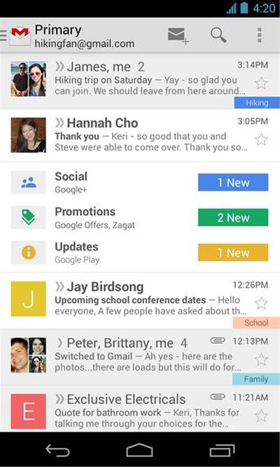
Gmail has decided to redesign the inbox and divide it into tabs so their users can more easily find their way in this forest of messages. Specifically, new inbox is divided into four tabs - Primary, Social, Promotions and Updates, and optionally fifth can be added which is named Forums. Incoming mail is automatically sorted into one of these tabs.
The user can manually drag each email to the desired tab, if they are not satisfied with Google's algorithm of sorting mail. It is also possible to force with the "star" mark certain emails to show under Primary tab beside the relevant one. The new look and organization of inbox will be implemented in the new version of Gmail application for Android and iOS that will become available in a few weeks. When it comes to the web client, Google will offer it gradually to users. But if you want to try out a new look as soon as possible, try to click on the wheel icon in the upper right of the Gmail interface. There will be an option "Configure inbox" with which you will be able to activate the new interface.
In case you dont like this upgrade, you can choose to show only the Primary tab which effectively means that the interface will look the same as before.
Tell us what you think in our Forum


