As you might realize we receive engineering samples from Intel for our CPU reviews and then for continued use in other reviews (motherboard, GPU etc.) these samples all have a few identifying characteristics. The most common is are the letters ES on the third line of text. This designates the product as an engineering sample (that is what ES stands for). Above that are trademarks and, of course the Intel Confidential stamp. For those of you that work with Intel for CPU reviews you know the agreement covers the fact that these CPUs are still Intel property and not for sale or redistribution. Below these lines are the country of manufacture, the serial number and other identifying markings.
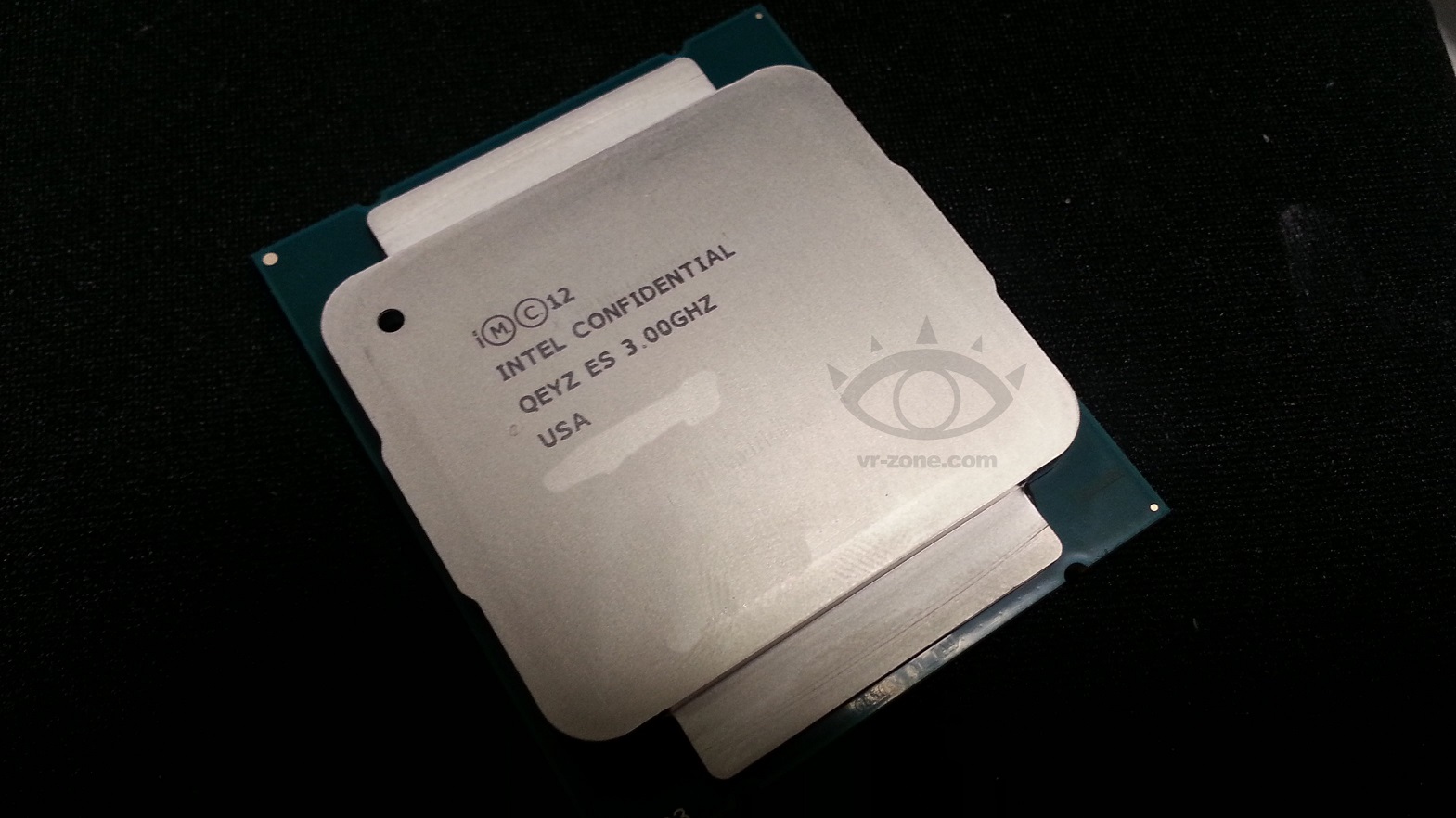
Now when you first look at the image at VRZone it looks pretty good. Trademarks, Check. Intel Confidential, Check, Series, ES and frequency, Check. Place of manufacture, Check. The serial number would need to be blanked out or someone would know exactly who this CPU went to (Intel does track that guys). Looks like a solid image of Intel’s next CPU… The problem is that something is not quite right with it.
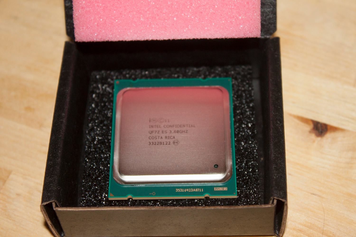
For one thing the lettering is simply too dark. If you have ever received a sample from Intel (or AMD) you know that the lettering is simply not that clear. It also tends to run off once it has been used. As you apply and remove thermal paste this lettering gets more and more faded and eventually goes away. Even on the day you get your ES chip the lettering is pretty faded as you can see in the image below of our Core i7 4960X.
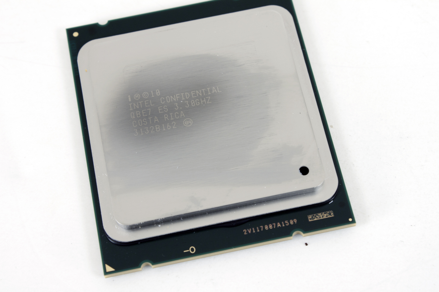
The next thing that I noticed is that the letters seems to be in the wrong place. If you look at the image of our 4960X you will see a small opening in the bottom right corner. In the VRZone image that opening is now in the upper left. This is not a deal breaker, but it is unusual as we looked over a few more Intel CPUs and found that opening to be pretty standard as you can see in the picture of our Core i7 3960X shown below. The next thing that caught our eye is the font. There is just something that is wrong with it outside being far too dark. If you look at the two images we have included you will notice that the zeros used all have the slash through them to make sure they are not mistaken for the letter “O”. On the VRZone image this is missing and it stands out quite a bit. Lastly the lid just looked wrong. It did not look like the other lids that Intel has used in the recent past and because of this we wanted to take a closer look.
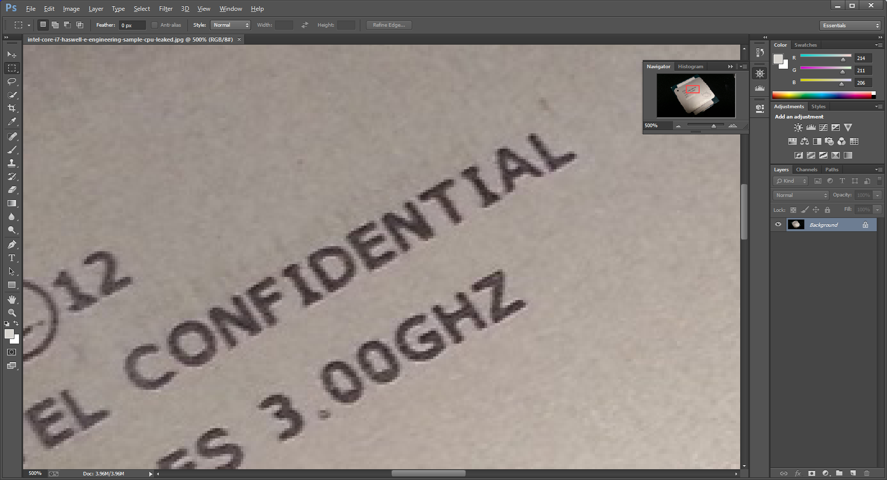
When we zoomed in on the lettering using Photoshop we noticed something right away. There is a thin line of miss-matched pixels around the lettering. This would not be present if it were a real CPU. You can also see what looks like the faint outline of the previous lettering on the lid. To us this CPU image now screams fake. There is too much that just does not add up and with the miss-matched pixels on the lettering that is the nail in the coffin. To be clear, we are not saying that VRZone faked this image. It simply appears that an image that they have posted is not genuine.
We all are waiting to see Intel’s next CPU, but we have to say that it is highly unlikely that this is it. We know that Intel will be eager to find out who put this image up even now that it looks to be a fake and the person responsible (if found) is not going to be very happy. For now it looks like all we have are specification and rumors about the real launch date. I expect that as the real date gets closer we will seem more “alleged” images and even benchmarks. Of course there will be sites that will also chose to release their “reviews” before the actual launch date, but that is another concern.
Tell us what you think in our Forum


