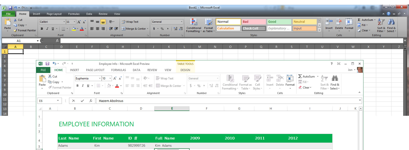
Now I have to wonder if Microsoft has cut a lot of those features out to make the “less is better” crowd of tech journalists happier. I would not be surprised to find out that they used the customer experience program to make their decisions again. The new apps are also highly Metro like. While some like the new look just a quick look over some of the screen shots lets me know that there is a tremendous amount of screen real estate that being wasted. Also the coloring for each app is a little much.
Microsoft will have two versions of Office available, but it is very clear which one they want you to use. Although pricing has not been released they have already made public the fact that they will have a subscription based version of Office 365 that will let you install Office 2013 on up to 5 PCs for a monthly fee. They are banking that people will want to pick this up if they offer it for a low enough price (even at $50 many would do it). However, to use this you have to have a Microsoft Account. This one item here might be what prevents someone from using it. Why would you want to tie yourself to Microsoft just to use your version of Office?
However as we have said Microsoft is convinced that it can make a mint on the cloud and so they are going to push for that no matter what. Some people will buy into it and they will make money off of them, but we have a feeling that after the first serious breach (we are guessing that is coming soon) things will be different. Right now Microsoft has enjoyed something of a charmed life in that they have not been hit by the evil that is out there on the Internet, but if they start gaining more customers (from the general public) this will change rapidly. Picture of Excel 2013 from Wired
We also take issue with a few comments that claim the new Office apps are more intuitive. Looking over the ribbon in Office 2013 it is nearly identical to Office 2010 so I am not sure where these claims are coming from. As you can see in the images below the ribbons are very close to each other in terms of the items shown and available. I have to say that for sheer readability Office 2010 is much easier on the eye than the pastel green that is shown there, but we do know that you can change that if you want to.
We are waiting for our copy of Office 2013 and will be reviewing it on both Windows 7 and Windows 8 to let you know how it really works. For now we will leave you with the firm information that the total number of new features is a nice round 9. Some of these aleady exist in Office 2010 like social cards in Outlook while others are pretty useless like adding the weather into your calendar. (Again who said the bloat was gone?) We have also found that the many of the first tests on a tablet are showing the new version of office to be less than friendly to touch screens. This is not a good thing (if true) considering that it is supposed to work seamlessly with Windows 8 and RT on tablets…
Discuss this in our Forum


