For starters let’s talk about why this is important to Microsoft as it relates to Windows 8. In the war of iOS Vs. Android one of the common items that is argued is the speed and crispness of the UI. In Windows (prior to Windows 8) the UI is static. Your desktop does not really move (unless you install a live wallpaper). Because of this there is little need to “speed” up the UI. Now with Windows 8 the UI is dynamic with live tiles, a moving interface (scrolling left to right and slide in menus). In order to make sure this is smooth Microsoft had to rethink the way the UI is processed by your graphical hardware. They also had to take into account that in most cases the UI would be rendered by very low powered GPUs that will rely on system memory and the CPU for some calculations.
To overcome these issues Microsoft reworked the way the UI is rendered and added in some very nice features to allow for the Metro UI to run at full speed. To start off they copied something that Android did after working with nVidia; they adopted a target frame rate of 60 FPS (Frames Per Second) to keep up with the refresh rate of most displays which is 60Hz (although 120 and 240Hz panels are becoming more common too). For those that do not know your actual “frame” rate that you see is limited to the refresh rate of your monitor. So while your GPU might be capable of rendering 300FPs your monitor can only display what its built-in refresh is without distortion in the image (tearing, lines and other graphical glitches). By matching the refresh rate of the panels you get a much smoother experience (as long as your hardware is up to it). To give an example of this try a game you like with V-synch on and then off, you will see that with the v-sync (which syncs your frame rate with the vertical refresh of your monitor) on your game is much better looking than with it off.
However just picking a higher target frame rate is not enough. Microsoft also needed to reduce the glitch or bad frame count as well as speed up the time it takes to get the first frame rendered. Another hurdle was to improve memory efficiency and CPU utilization in systems with an integrated GPU. For most computers with a discrete GPU these items are not an issue, which again supports the fact that Windows 8 is built for mobile and not the desktop. Still Microsoft is doing something smart to ensure that their Metro UI renders quickly and smoothly, so for this we have to give them credit.
 |
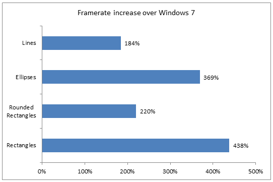
Now for the graphs and numbers they are using… well here is where we have to call them. If you look at the frame rate that the Windows 7 UI renders between 1FPS at idle to 44FPS when you are moving items around which is more than fast enough for the Windows 7 desktop. For the Windows 8 V.s Windows 7 comparrison; Microsoft did not choose to make any direct comparisons that have measurable numbers (like actual frame rate of the UI). Instead they decided to break everything down into groups which are not how items are rendered. Your computer does not say; hey, I have to render a line, then a rectangle, then a circle. It simply renders the images on the screen as a composite whole. So these percentages broken out like they are mean nothing at all to the end user. It would have been more helpful to show the actual frame rates of the desktop performing the same tasks (opening a picture, moving that picture to the four corners of the screen, etc). Instead all we have are base numbers with no meaning at all. To say Windows 8 draws rectangles 438% faster than Windows 7 is a meaningless statistic as Microsoft provides no baseline. If they had said Windows 7 draws rectangles at 15 Frames per Second and Windows 8 is 438% faster that would have had meaning. In only one place did they give raw numbers this in in the time to render a very basic video where they claim that Windows 8 rendered it in 4.38 Seconds Vs 7.28 seconds on Windows 7; again there is no reference to the hardware used for this test, which makes it of no value. This inclusion of raw numbers for one test, but a complete omission for everything else makes us think that the rest of the raw numbers are not impressive. Microsoft in order to keep up the “show” used the percentages for their marketing blog entry. Still the lack of any reference to the hardware used for this test negates the whole thing since we cannot compare their findings they are little more than unsubstantiated claims.
While we will give Microsoft credit for being smart enough to realize that they had to make the Metro UI fast, responsive and smooth we are going to call BS on their lame attempt to use percentages without reference in their blog.
Building Windows 8 Blog
Discuss this in our Forum


