News
Microsoft shows off improvements to file management in WIndows 8
- Details
- By Sean Kalinich
- Hits: 2082
 Microsoft is looking to pull off a reverse of the way Vista was killed. For those of you that remember Vista (and that should be most of you) you will know that Vista was pretty much dead before it hit the market due to several very negative statements that ended up running around the internet like crazy. It created a phenomenon that we call the repeated truth. What happened was that these statements were linked and sourced by so many blogs that even though some of the original writers had never even seen the OS it became “fact” that it was flawed. I am not saying that Vista did not have more than its fair share of problems but it was not all bad.
To combat this Microsoft has put a much more visible blog online called “Building Windows 8”. This blog has articles about some of the key features and improvements coming in Windows 8. We have already told you about the improved USB 3.0 stack and the accompanying power management layer. Now we are going to talk about improvements to file management system.
According to Microsoft moving, copying, renaming and deleting data accounts for 50% of the commands used by consumers. This data is really not a shock as it only makes sense when you think about the number of songs downloaded, digital images moved and e-mailed, pictures grabbed from sites like Grumpy Rabbit and others. Because they finally noticed this (and because the smaller and move portable tablets and ultra-thins will have limited space) the Windows 8 Engineers decided to revamp the way that files are manipulated. What they did was make your file management look more like the download manager in IE or FireFox with a few nice extras thrown in.

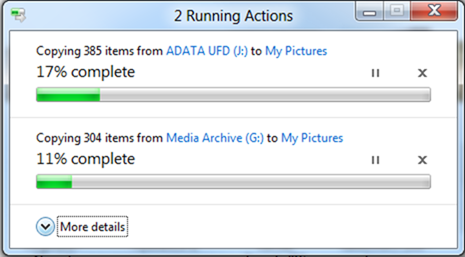
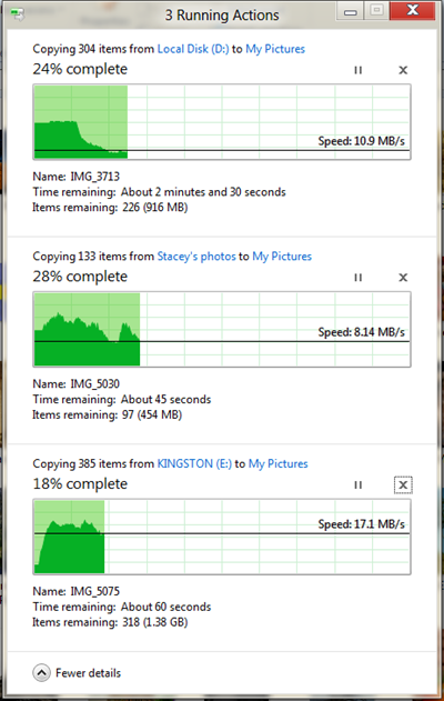
The basic view still looks like the typical copy or move window with the exception of the fact that as you add more files to the queue you do not get another window. Instead the new file shows up in the same window making it easier to monitor. The “More details” option has also gotten a face lift. Now when you click on this you get a real-time throughput graph of each pending job which is pretty cool.The last thing the Windows 8 team did was to revamp the copy and replace window. Instead of the boring single thumbnail you now get a complete listing of conflicts and the option to choose what you want to do with each.

This may seem like a little thing on the surface, but in terms of usability and user experience it is huge. I hope that the improvements keep coming and all are like this one.
Source Building Windows 8
Discuss this in our Forum


