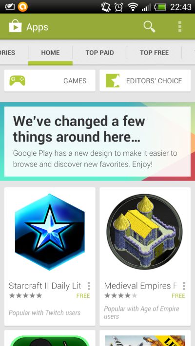
 While the evil tongues will say that the new look is very successful combination of Apple's App Store and Windows Phone Marketplace (except that it is leaning more toward the WP store), rather than the original solution. New Google Play is certainly refreshing, and our first impressions are positive.
There is no more specific title page, or home page to point out only a small number of top apps, now there is infinite number of applications that are pointed out with large icons, and it presents the mix of the most popular titles. Overall everything is simplified now, and in some way more localized.
Do we need another redesign? Tell us in our Forum
News
Another redesign for Google Play
- Details
- Hits: 2011
 |
If you use Android then Google Play is your main destination where you find new interesting, useful, fun application. Google Play has often changed appearance in recent years, (sometimes even the name, but with not so much success), so it's nothing extraordinary that they have once again decided to do a new redesign.


