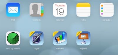
Of course Apple did not stop here so they updated the interface of Mail, Calendar, Notes, Reminders and Find My Phone application that now look like on iOS 7. Free apps from iWork package like Pages, Numbers and Keynote still have the old look. In addition to the new look, iCloud received the possibility of easier and faster access to the menu of other applications from the application in which you are currently working.
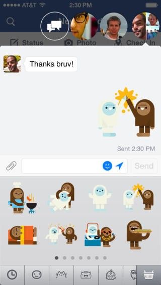
Team from Facebook also joined the customization of their own app, which along the regular bug fixes within the application, additionally got new cutomized interface. Like most menus within iOS 7 Facebook search and navigation bar also became transparent, while the navigation on the left and right side moved within the button "more" which is located on the bottom of the application.
New application interface is available exclusively for iPhone users, while iPad users will continue to have a well-known old interface. For now, Facebook has no plans to bring new interface to tablets, because according to them the old design is better suited to work on the tablet.
Tell us what you think in our Forum


