DiskStation Manager -
One of the biggest things that sets NAS devices apart from each other is the WebUI and connectivity tools that are used to configure, secure and also monitor the device. Synology has been perfecting their DiskStation software for some time now and have gotten things dialed in quite well. We have worked with multiple NAS devices and SANs (Storage Area Network) and out of them all Synology has one of the best WebUIs out. It is one of the more intuitive and fast webUIs we have tested.
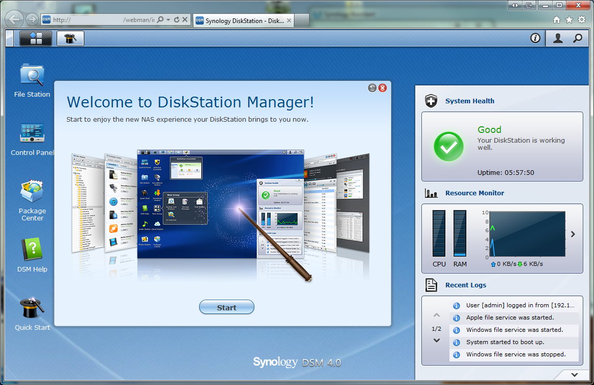
Once you are logged in the layout of the DiskSation WebUI (DiskStation Manager 4.0) looks a lot like a desktop with a wallpaper background, icons, and even a taskbar at the top. Starting off at the taskbar let’s take a look at what you can do.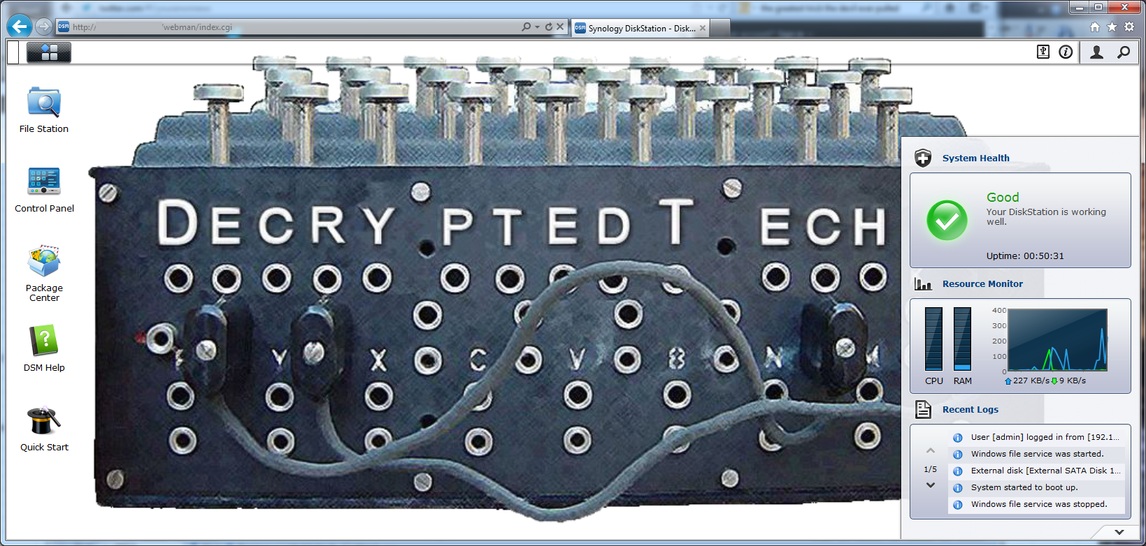
In the upper left-hand corner there is a small section of the taskbar that looks different. This is the “show desktop” button. Right next to it is the DSM “start” button. Clicking on this opens up a new window with that has some of your basic options for configuring your new DiskStation.
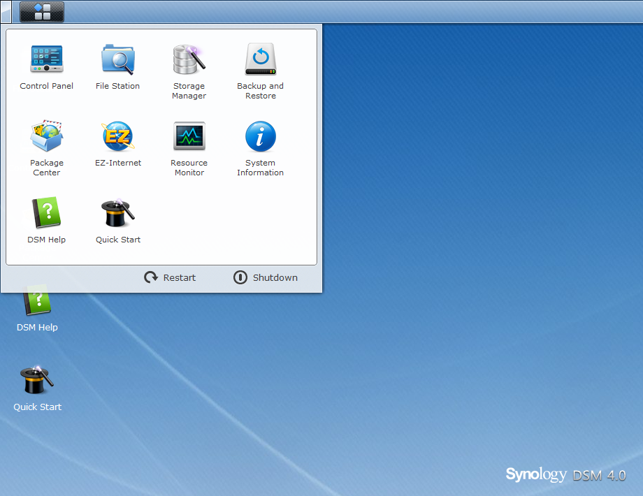
Now many of these options are already on the desktop as icons (just like in Windows or OSX). You can also drag these out onto the desktop for quick access. The start menu also has your shutdown and restart options here. Moving over to the right you have options to eject any external devices, look at any events logout and configure the current user, and of course search through the DSM.
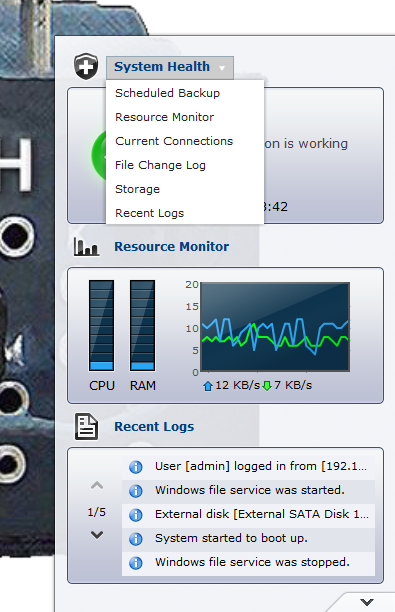
On the desktop (in addition to the icons is a widget that allows you to cycle between a few views. The default is system health but you have scheduled backups, resource monitor, current connections, file change log storage and recent logs. There are three sections in the widget and you can set each one to a different view so you are getting the most out of your time in the DSM. You can also minimize it if it is in your way.
Now that we have gone through the meat of the desktop let’s look at the individual pieces that make up the DiskStation.

 As the push for cloud based storage and services becomes greater we have been taking a look at the value of these from not only a monetary view, but also from a privacy and security view. To this end we have been tinkering around with a few Network Attached Storage Devices (NAS). One of our first is the Synology DiskStation DS1512+. We have already

